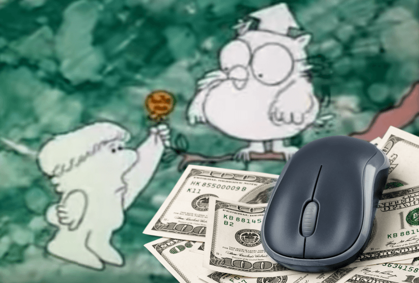
Remember wise old Mr. Owl?
Please tell me you do. It’s bad enough that I recently brought home my first pair of bifocals. If you tell me you’re too young to remember Mr. Owl, I will cry. Seriously.
Is your website costing you revenue? If your menu doesn’t make it super easy for visitors to spend money, then it sure is!
When you’re thinking about your website’s design and how easy it is to navigate, I want you to remember wise old Mr. Owl and ask yourself, “How Many Clicks Does It Take?”
Years ago, web designers swore by the “three click rule” and were convinced that if users couldn’t find what they were looking for in three clicks or less, they would get frustrated and abandon the site. Recent usability testing by web design experts has shown that isn’t necessarily the case.
That being said, there are certain things you don’t want people to have to go hunting for on your website. I encourage my clients to think about the top three things they want visitors to their website to be able to find quickly. Then the goal is to figure out how to design the site so they can access those elements easily from any page.
A few questions to consider…
Nonprofits:
- Does your website have a “Donate Now” button that is always visible or do visitors have to go looking for it?
- How easy is to find contact information for someone who can answer questions about donating?
Small Businesses:
- Can your clients access your online payment portal from any page on your website?
- Is your contact information readily available on all pages?
If it takes too much time and effort for folks to spend money on your website, it might be time to think about making some simple design changes.
- Cat Lady Fun Fact: Did you know you can print out your own “Clean Stick Award” certificate, signed by Mr. Owl, from the Tootsie Roll website? You’re welcome!